Menu
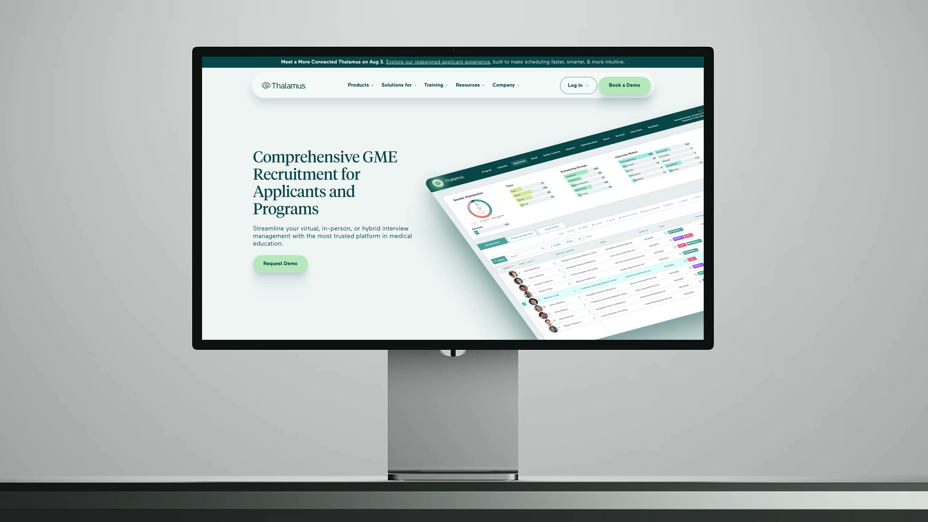
Residency and fellowship interviews help shape a doctor’s career. Thalamus handles the machinery behind them: scheduling, application screening, and analytics for graduate medical education programs. As its family of products grew, the brand needed a way to hold them together.
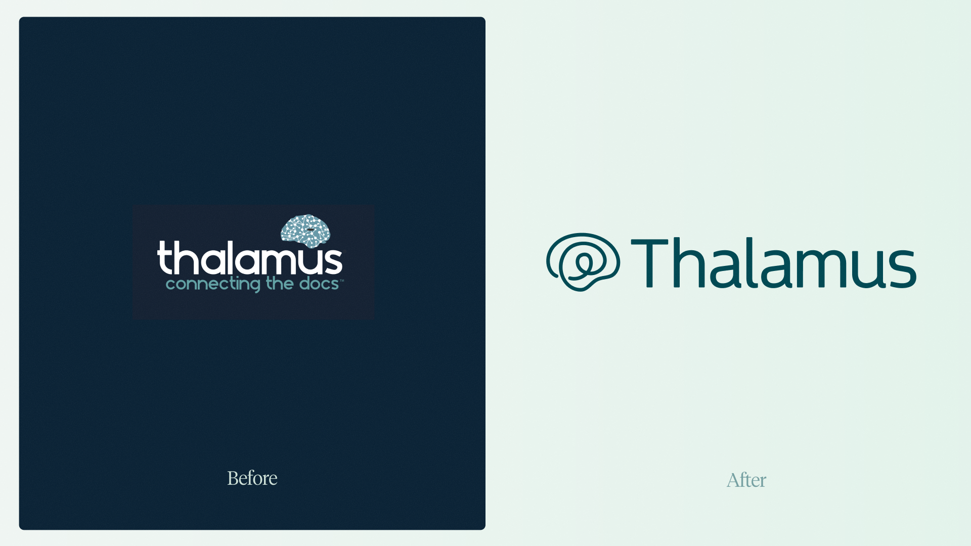
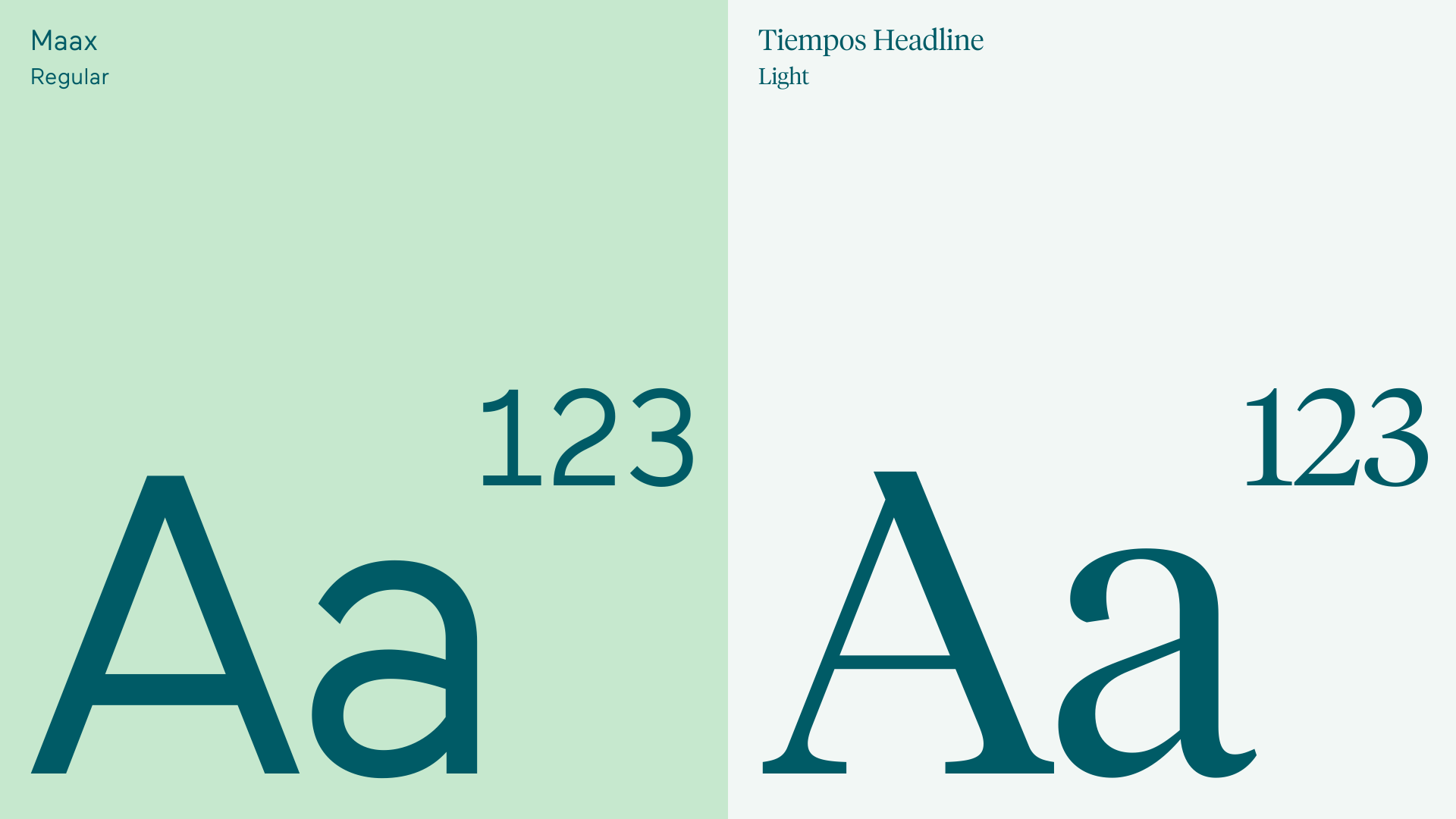
We refreshed the identity and built the guidelines to put it to work. A mint and teal palette, expressive gradients, and a mix of headline and text typography give the product family a common foundation. Each offering has its place, while the whole remains recognizably Thalamus.
Web design: Kinetic Studio
Web development: Partywave
“We had a really challenging story to tell, but the outcome we got to with Lunour was great. They get the bigger picture of what needs to be done.
I’ve worked with three other branding firms—all of which were horrible—other than the team at Lunour. They were very consultative, no ego—just humble, with expert results.”